Business & Organization Identity
|
Print Design & Production
|
||||
|
Logo Design
Business & Organization Identity |
||||
|
|
||||
|
OBERONIX
|
||||
 |
||||
|
Overview
|
||||
| This logo was created for a company that specializes in business IT services.
Logo Design & Business Cards |
||||
|
|
||||
|
the dotcomers.com
|
||||
 |
||||
|
Overview
|
||||
| The development of this logo was part of an identity creation and stationary design project for a company specializing in obtaining domain names for corporate clients.
Logo Design, Business Cards, Letterhead, Envelopes |
||||
|
|
||||
|
Daedalus Games
|
||||
 |
||||
|
Overview
|
||||
| I created this logo to reflect the key elements of the legendary inventor that this game manufacturer had chosen to name itself after. I wanted the shape and style of the logo to express an Art Deco quality and appear similar to a pilot’s lapel pin. |
||||
|
|
||||
|
Mentor Business Services
|
||||
 |
||||
|
Overview
|
||||
| MBS is a marketing company that provides a variety of business consulting and training services to entrepreneurs in the gay community. |
||||
 |
||||
 |
||||
 |
||||
|
|
||||
|
Natural Environment Recovery Inc.
|
||||
 |
||||
|
Overview
|
||||
| This company provided an 'environmentally friendly' solution for the treatment of industrial sites contaminated with toxic chemicals. |
||||
|
|
||||
|
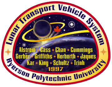
LTVS – RPU
|
||||
 |
||||
|
Overview
|
||||
| This logo (which doubles as a shoulder patch) was commissioned for a scientific research project undertaken by graduate students at Ryerson Polytechnic University in Toronto, Canada. |
||||
|
|
||||
|
Starstruck North Productions
|
||||
 |
||||
|
Overview
|
||||
| This company specialized in marketing science fiction and fantasy art prints to retail stores and directly to the public. They wanted their logo to be genre-related, dynamic (but business-like), and inexpensive to reproduce under various circumstances — hence the choice of a single PMS color, enabling the design to print equally well in greyscale or black and white. |
||||
|
|
||||
|
Bakka – The Science Fiction Bookstore
|
||||
 |
||||
|
Overview
|
||||
| For decades Bakka has been widely known as the premier SF and fantasy bookstore in Toronto, Canada. Over the years it hosted numerous author signings and book release parties. |
||||
|
|
||
|
This page was last updated June 27, 2010
Content copyright © 1980 to 2010 by Kevin Davies. All rights reserved. |
||